BRANDING HEROS + RIVE.

‘HEROS + RIVE’, pronounced hear-oss + riv.
When identifying a brand and ultimately wanting customers to make a connection with that brand, it needs to be a very efficient way of telling a story and a symbol of what a brand is and what they are about. How much meaning can be placed into such a small emblem may be the struggle, especially when it needs to be used practically over many different mediums. In the regard of furniture, it mustn’t be too detailed as it will likely be used to brand a piece of furniture and printed onto a few clothing items, email signatures etc. The finer detail will certainly be lost when branding timber and so, to overcome this, my personal goal was for a logo to be as unambiguous as possible while still reflecting back over what I wanted the brand to resemble.
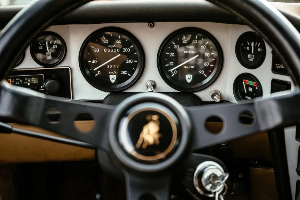
The inspiration came while restoring my own almost vintage motorcycle years ago and exploring different speedometer faces. I came across images of vintage Ferrari and Lamborghini speedometers and how such a simple and practical dial face can be quite beautiful in the way they are designed. The letter spacings, the bold contrast, a speedo is one of the first things I look at when getting into a car, especially an old car as every make has their own design, font, colour, number of dashes to be read. The whole design idea of a speedo shall be simple and uncluttered so that the text is read quickly and efficiently at a glance, while ripping it down at a mile-a-minute.
A timeless sans-serif font I found to be prevalent while slightly different across car-makers. The ‘circular’ formation of the letters in ‘HEROS’ mimic a curved appearance of the text around a speedometer with usually a horizontal piece of text, usually a brand name in the centre of the speedometer face. The italic ‘+’ a symbol of movement, again relating to the movement of these beautiful pieces of engineering.
The actual meaning behind the brand name - After watching a Harley Davidson docudrama years prior, when naming the now synonymous brand, one of the lads was quoted saying ‘do good by the name’ and so they settled on the two men’s surnames. My surname being Rive, I wanted the challenge to somehow integrate this into the brandname. As for ‘HEROS’, this is an anagram, including letters from my given name, Christopher, rearranged to match Rive in the best way phonetically. The result, I thought somewhat reflected a European name that relates back to these automobile brands.
The main ethos of Heros + Rive is timelessness. Creating furniture that not only is timeless in design but timeless in quality, something that aforementioned brands like Ferrari, Lamborghini and Harley Davidson have built their values upon and why they have such an incredibly loyal following.